 SEARCH
Evaluating Models: Hating on R-squared
Jun 16, 2022
There are a number of measures that are used to evaluate the performance of machine learning/chemometric models for calibration, i.e. for predicting a continuous value. Most of these come down to reducing the model error, the difference between the reference values and the values predicted (estimated) by the model, to some single measure of “goodness.” The most ubiquitous measure is the correlation coefficient R2. Many people have produced examples of how data sets can be very different and still produce the same R2 (see for example What is R2 All About?). Those arguments are important but well known and I’m not going to reproduce them here. My main beef with R2 is that it is not in the units that I care about; it is in fact dimensionless. Models used in the chemical domain typically predict values like concentration (moles per liter or weight percent) or some other property value like tensile strength (kilo-newtons per mm2) so it is convenient to have the model error expressed in these terms. That’s why the chemometrics community tends to rely on the measures like root mean square error of calibration (RMSEC). This measure is in the units of the property being predicted.
We also want to know about “goodness” in a number of different circumstances. The first is when the model is being applied to the same data that was used to derive it. This is the error of calibration and we often refer to the calibration R2 or alternately the RMSEC. The second situation is when we are performing cross validation (CV) where the majority of the calibration data set is used to develop the model and then the model is tested on the left out part, generally repeating this procedure until all samples (observations) have been left out once. The results are then aggregated to produce the cross-validation equivalent of R2, which is Q2, or the cross validation equivalent of RMSEC, which is RMSECV. Finally, we’d like to know how models perform on totally independent test sets. For that we use the prediction Q2 and the RMSEP.
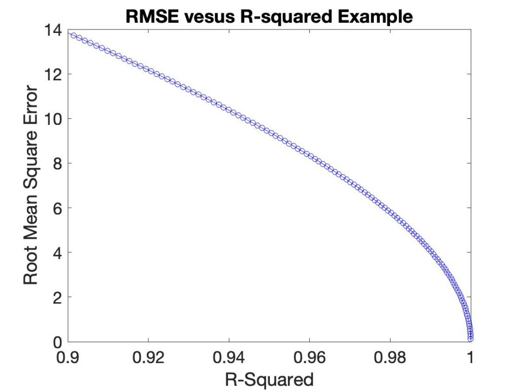
Besides the fact that R2 is not in the same units as the value being predicted, it has a non-linear relationship with it. In the plot below the RMSEC is plotted versus R2 for a synthetic example.
Overfit is another performance measure of interest. The amount of overfit is the difference between the error of calibration (R2 or RMSEC) and prediction, typically in cross-validation (Q2 or RMSECV). Generally, model error is lower in calibration than in cross validation (or prediction, but that is subject to corruption by prediction test set selection). So a somewhat common plot to make is R2-Q2 versus Q2. (I first saw these in work by David Broadhurst.) An example of such a plot is shown in Figure 2 on the left for a simple PLS model where each point is using a different number of LVs. The problem with this plot is that neither axis is physically meaningful. We know that the best models should somehow be in the lower right corner, but how much difference is significant? And how does it relate to the accuracy with which we need to predict?

I propose here an alternative, which is to plot the ratio of RMSECV/RMSEC versus RMSECV, which is shown in Figure 2 on the right. Now the best model would be in the lower left corner, where the amount of overfit is small along with the prediction error in cross-validation.
Lately I’ve been working with Gray Classical Least Squares (CLS) models, where Generalized Least Squares (GLS) weighting filters are used with CLS to improve performance. Without going into details here (for more info see this presentation) the model can be tuned with a single parameter, g, which governs the aggressiveness of the GLS filter. A data set of NIR spectra of a styrene-butadiene co-polymer system is used as an example (data from Dupont thanks to Chuck Miller). The goal of the model is to predict the weight percent of each of the 4 polymer blocks. The R2-Q2 versus Q2 plot for the four reference concentrations are shown in the left panel of Figure 3 while the corresponding RMSECV/RMSEC versus RMSECV curves are shown the right. The g parameter is varied from 0.1 (least filtering) to 0.0001 (most filtering).

As in figure 2 approximately the same information is presented in each plot but the RMSECV/RMSEC plot is more easily interpreted. For instance, the R2-Q2 plot would lead one to believe that the predictions for 1-2-butadiene were quite a bit better than for styrene as their Cross-validation Q2 is substantially better. However, the RMSECV/RMSEC plot shows that the models perform similarly with an RMSECV around 0.8 weight percent. The difference in Q2 for these models is a consequence of the distribution of the reference values and is not indicative of a difference in model quality. The RMSECV/RMSEC shows that the models are somewhat prone to overfitting as this ratio goes to rather high values for aggressive GLS filters. The is less obvious in the R2-Q2 plot as it is not obvious what this difference really relates to in terms of amount of overfitting. And a given change in R2-Q2 is more significant in models with high Q2 than with lower Q2. The R2-Q2 plot would lead one to believe that the 1-2-butadiene model was not overfit much even at g = 0.0001, whereas the styrene model is. In fact, their RMSECV/RMSEC ratio is over 5 for both these models at the g = 0.00001 point, which is terribly overfit.
The RMSECV/RMSEC plot can be further improved if the reference error in the property being predicted is known. In general it is not possible for the apparent model performance to be better than this. Even if the model is predicting the divine omniscient only God knows true answer, the apparent error will still be limited by the error in the reference values. Occasionally models do appear to predict better than the reference error but this is generally a matter of luck. (And yes, it is possible for models to predict better than the reference error, but that is a demonstration for another time.) So it would be useful to add the (root mean square or standard deviation) reference error, if known, as a vertical line.
Based upon the results I’ve seen to date, I highly recommend the RMSECV/RMSEC plot over the R2-Q2 plot for assessing model performance. Model fit and cross-validation metrics are in units of the properties being predicted, and the plots are more linear with respect to changes in these metrics. This plot is easily made for PLS models in PLS_Toolbox and Solo, of course!
BMW